What Makes a Page Feel “Professional” (And Why It Matters for Conversion)
Some pages look polished and trustworthy at first glance. Others feel confusing, cluttered, or unfinished, even if the information is the same.
The difference isn’t always the offer. It’s often the way the page is designed and structured.
A “professional-looking” page isn’t just about aesthetics.
It directly affects whether someone stays, trusts, and takes action.
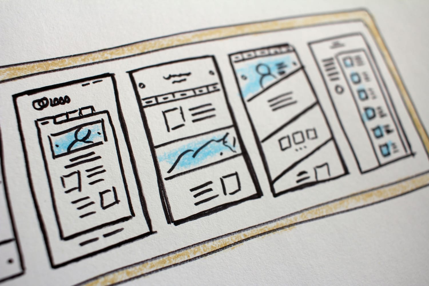

Photo by Hal Gatewood on Unsplash / Photo by János Venczák on Unsplash
1. Clear Visual Hierarchy
One of the biggest differences between amateur and professional pages is clarity.
A professional page guides your attention naturally:
• what to read first
• what matters most
• what to do next
This is done through:
• font size
• spacing
• contrast
• layout structure
When everything looks equally important, nothing stands out.
_________________________________________
2. Consistent Design System
Professional pages feel cohesive.
That usually means:
• consistent colors
• limited fonts
• uniform button styles
• balanced spacing
When design elements change randomly, the page feels unstructured. Consistency builds familiarity, and familiarity builds trust.
_________________________________________
3. Enough White Space
Many beginners try to “fill” every part of the page. But professional design uses space intentionally.
White space:
• improves readability
• reduces overwhelm
• highlights important elements
It gives your content room to breathe.
_________________________________________
If you’re still figuring out what setup works best for you, you don’t have to guess.
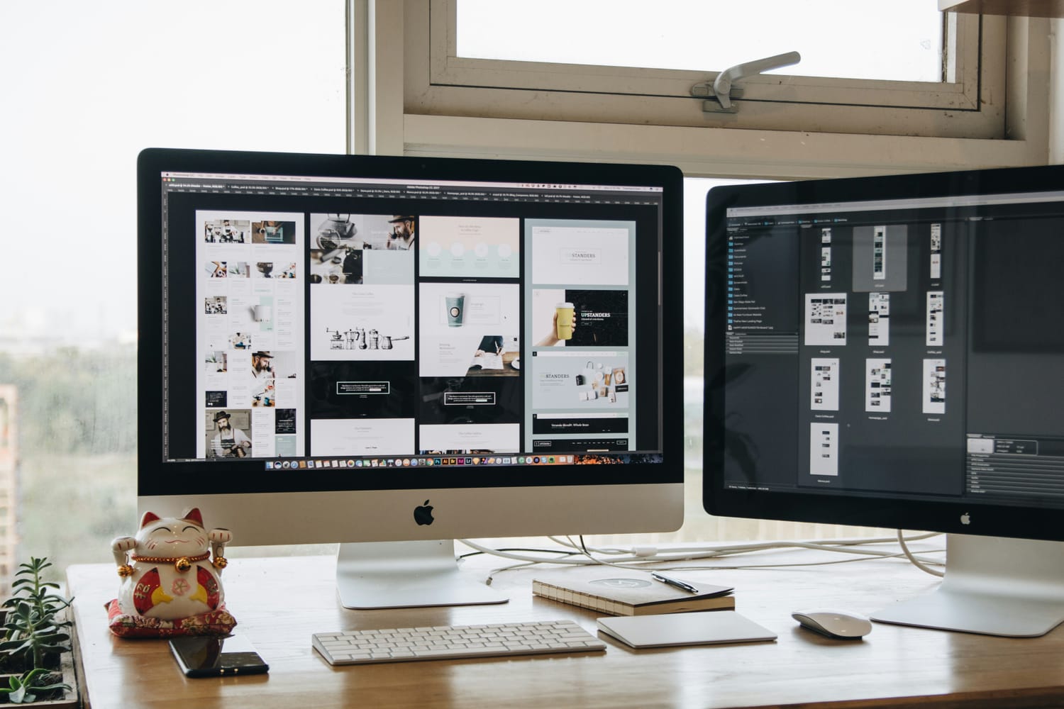
Photo by Tran Mau Tri Tam ✪ on Unsplash
_________________________________________
4. Strong and Clear Messaging
Design alone doesn’t make a page professional. Clarity in messaging plays a major role.
Visitors should quickly understand:
• what you offer
• who it’s for
• what to do next
If they have to figure it out, they usually won’t stay long.
_________________________________________
5. Focused Call-to-Action
A professional page doesn’t overwhelm visitors with too many choices. Instead, it focuses on one main action.
This could be:
• booking a call
• signing up
• requesting an audit
When the next step is clear, people are more likely to take it.
_________________________________________
Why This Matters
A page that feels “professional” doesn’t just look better.
It builds:
• trust
• clarity
• confidence
And these are the factors that influence whether someone becomes a client.
Not Sure How Your Page Comes Across?
Sometimes it’s hard to see your own page objectively. What feels clear to you might feel confusing to someone else.
I offer a free funnel audit where I review your page’s structure, messaging, and design to help you understand what’s working and what can be improved.
Start Your Free Funnel Audit →
Final Thought:
Professional design isn’t about making things look perfect. It’s about making things feel clear, intentional, and easy to follow. And often, that clarity is what leads to better results.
HEY, I’M MARI
I’m a conversion-focused visual designer from the Philippines with a background in traditional and digital art. My work blends creativity and strategy to design pages that don’t just look beautiful, but guide visitors toward action.
I help freelancers, creators, and small businesses bring clarity to their funnels through thoughtful layout, visual hierarchy, and purposeful design.


FREE AUDIT ↓
Helping freelancers, creators, and small businesses build simple, conversion-focused funnels that turn clicks into clients.
Not sure where your funnel stands? Start with a free funnel audit.